
Legato Brand & Label Concept
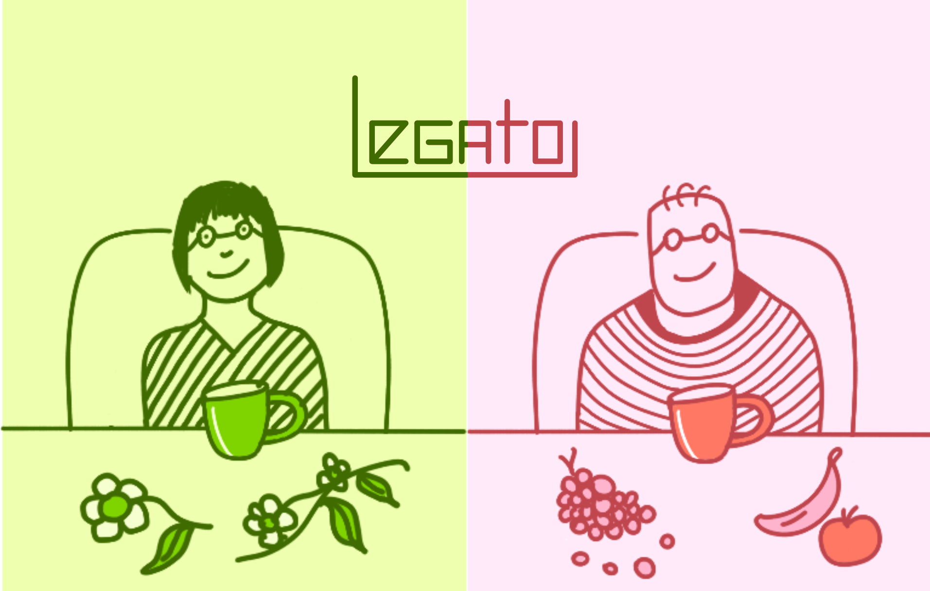
This project presents the identity and packaging design for Legato, an Uruguayan loose-leaf tea brand created to accompany moments of calm, introspection, and memory. The concept is rooted in the remembrance of good times, cultural tradition, and the idea of enduring quality, positioning the product as a daily ritual rather than a fast-moving commodity.
Based on the client brief and target audience research, the visual system is built through a sober and timeless aesthetic, using a classic typographic approach, a restrained color palette, and graphic elements that reference craftsmanship and heritage. The result is a serene and honest identity designed to create an emotional connection and communicate trust, continuity, and respect for tradition.

Legato Herbal Green
HEX: #406B00
C: 40 M: 0 Y: 100 K: 6
Legato Fruit Red
EX: #C0464E
C: 0 M: 65 Y: 60 K: 2
Legato Brilliant Green
HEX: #7FD400
C: 40 M: 0 Y: 100 K: 20
Legato Peach Red
HEX: #FF7863
C: 50 M: 40 Y: 0 K: 15
Legato Light Red
HEX: #FFEAF9
C: 0 M: 10 Y: 5 K:
Legato Light Green
HEX: #EEFFB0
C: 5 M: 0 Y: 30 K: 0

Legato’s identity system was developed based on the client brief, which emphasizes tradition, remembrance, and long-lasting quality. The use of a classic typographic style supports a sense of sobriety, respect, and continuity, while a restrained color palette reinforces a timeless and honest aesthetic aligned with the target audience.
The graphic system avoids unnecessary elements and relies on balanced, highly legible compositions, allowing the product and its message to take center stage. The identity is designed to perform consistently across packaging and brand applications, ensuring visual and emotional coherence at every touchpoint.
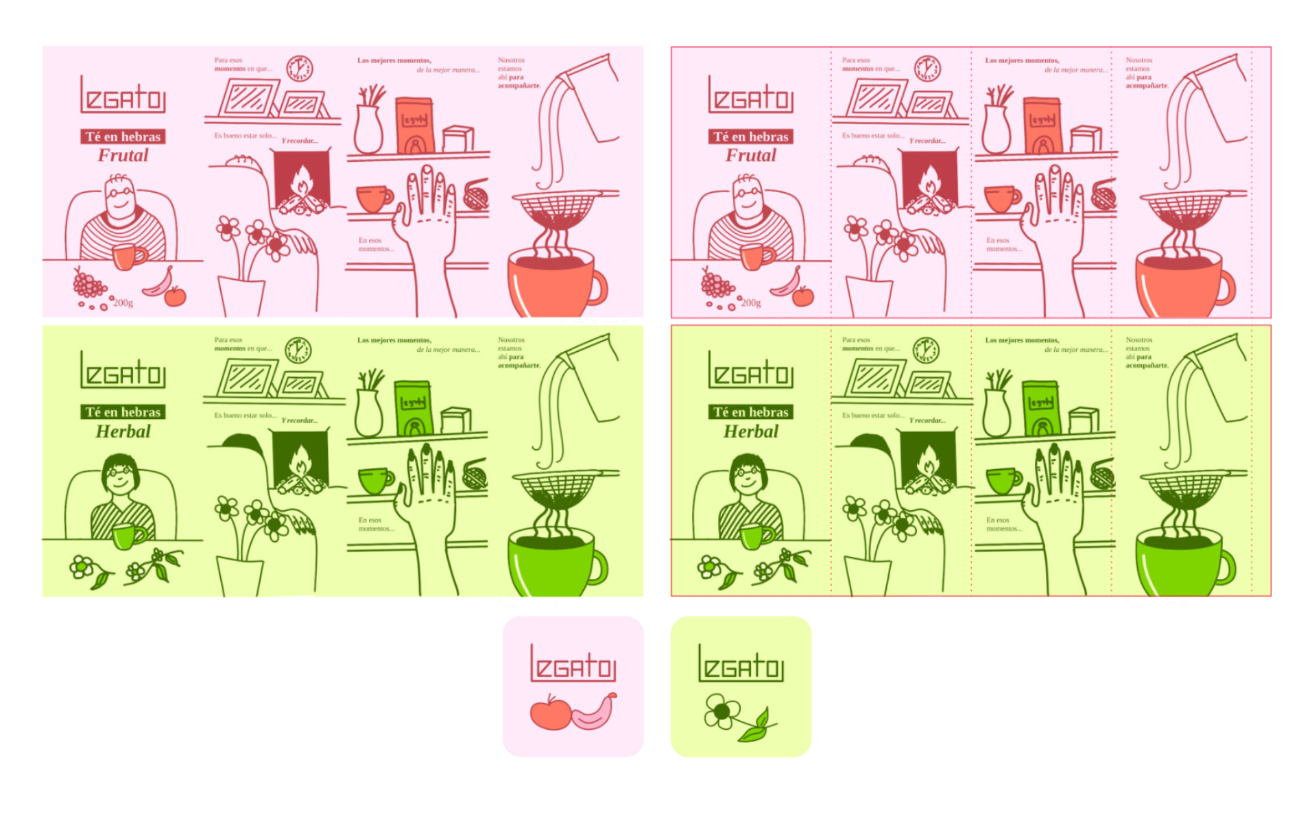
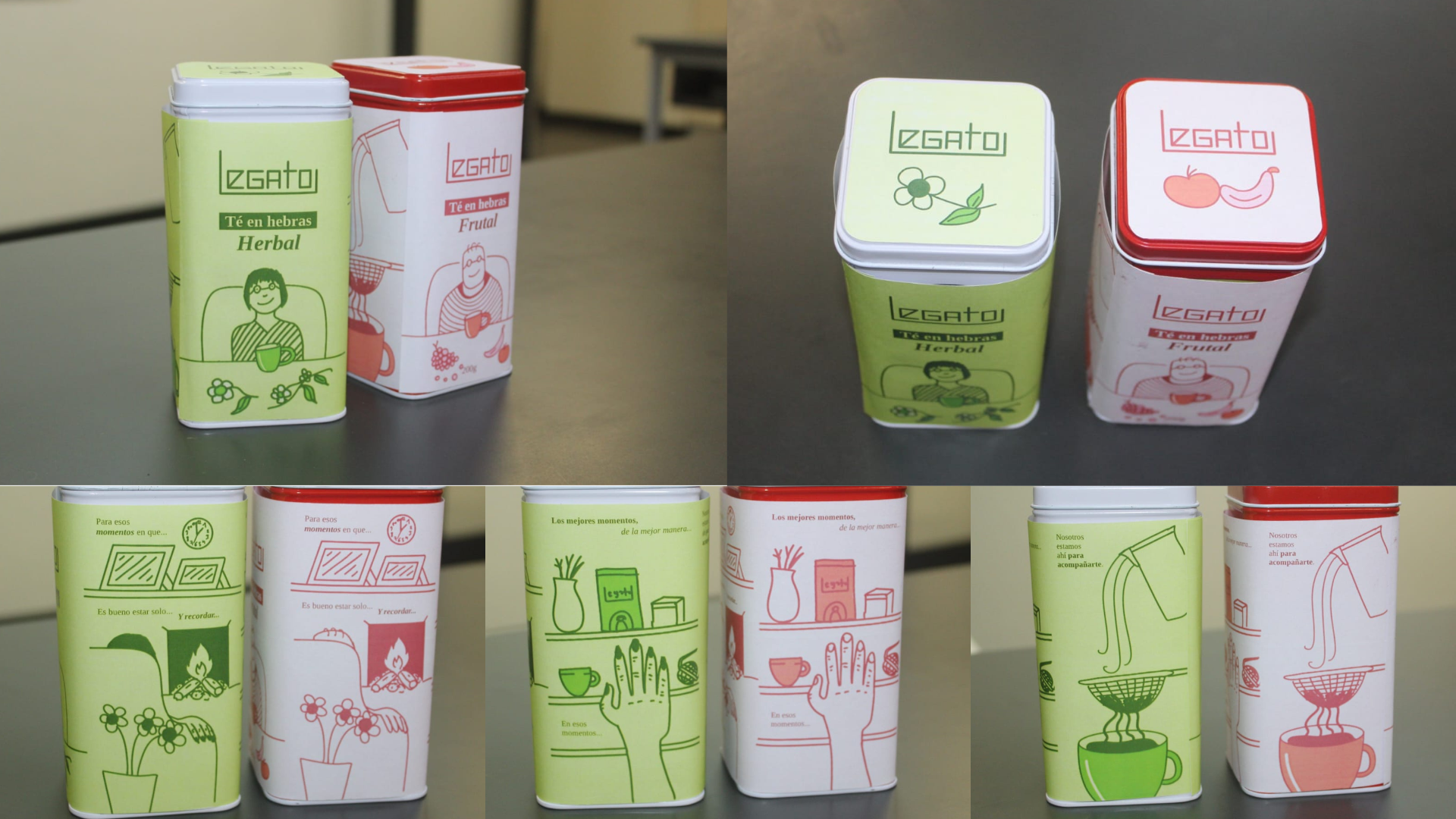
Legato’s label design wraps around the tea tin, using simple illustrations to evoke moments of warmth by the fireplace—those quiet occasions when we enjoy a good cup of tea and reminisce about the good old days.
This project offered the opportunity to build a brand from the ground up, exploring how identity and packaging can convey an emotional narrative rooted in tradition and remembrance. Throughout the process, skills in conceptual thinking, visual system development, and translating abstract values into concrete design decisions were strengthened.
The work also focused on technical packaging aspects such as wrap-around label design, information hierarchy, and adaptation to physical formats. Overall, the project reinforced a strategic understanding of packaging as a key tool for emotional connection and brand consistency.