
Chamuyo Brand & Label Concept
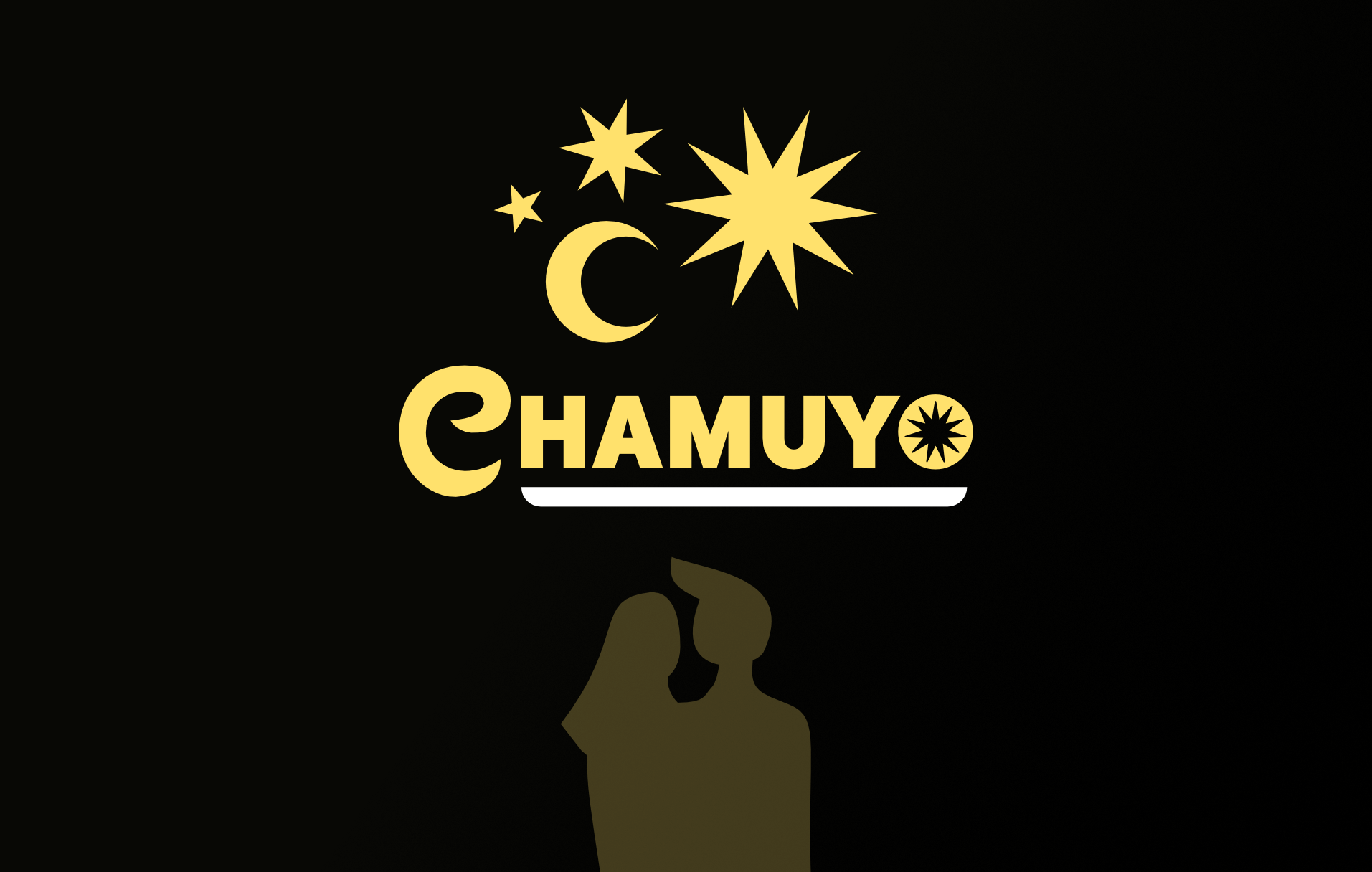
This project presents the identity and packaging design for Chamuyo, an artisanal Uruguayan liqueur created for special occasions and shared moments. The brand is built around a friendly, informal, and “chamuyero” tone, aiming to stand out within the category through a strong, local, and authentic personality that moves away from conventional liquor branding codes.
Based on the client brief and target audience research, the visual system is grounded in the concepts of craftsmanship, Uruguayan identity, and seduction, using a customized typeface, a high-impact color palette, and graphic elements that emphasize conversation, invitation, and connection. The result is an expressive and memorable identity designed to stand out on the shelf and emotionally engage a young adult audience.

Chamuyo Golden Yellow
HEX: #DD9200
C: 0 M: 35 Y: 100 K: 15
Chamuyo Starry Yellow
EX: #FFE06B
C: 0 M: 12 Y: 60 K:
Chamuyo Night Black
HEX: #1A1A1A
C: 0 M: 0 Y: 0 K: 80
Chamuyo Letter Yellow
HEX: #B89200
C: 0 M: 20 Y: 100 K: 30

Chamuyo’s identity system was developed based on the client brief, which defines an informal, artisanal, and distinctly Uruguayan tone. A customized, handwritten-style typeface reinforces a sense of closeness and spontaneity, while a high-impact color palette conveys warmth, playfulness, and a nighttime atmosphere aligned with the product’s social consumption context.
Layouts and graphic elements prioritize expressiveness without compromising legibility, allowing the packaging to act as a conversation starter. The system is designed to stand out on the shelf and communicate personality at first glance, ensuring visual and narrative consistency across all brand applications.
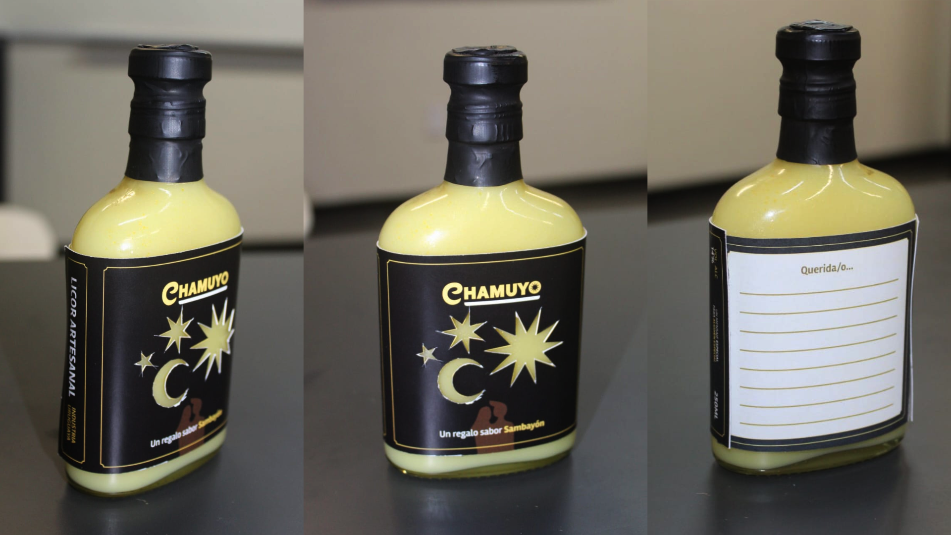
The label elements were designed to interact with the liqueur’s natural yellow color, using star-shaped cutouts that reveal the product inside. On the back, a small attached letter functions as a keepsake, doubling as a love note for the person receiving the liqueur as a gift.
This project involved building a brand from the ground up, integrating visual identity and packaging into a single expressive system. Throughout the process, work focused on defining tone, personality, and brand values, translating cultural and emotional concepts into concrete design decisions.
The project also emphasized technical packaging aspects such as die-cut label design, using the product itself as part of the visual language, and incorporating additional physical elements. Overall, it reinforced a strategic view of packaging as an experiential and communicative tool beyond its functional role.