
Abitab Rebranding concept
This project focuses on the redesign of Abitab’s visual identity, a leading Uruguayan company in payment and collection services with a long-standing history and strong nationwide presence.
The main objective was to update the existing identity system while preserving its accumulated brand value, addressing technical and visual inconsistencies, and expanding its graphic resources to improve coherence and adaptability across multiple platforms, particularly in digital environments and physical service points.
Based on strategic research and brand analysis, the proposal takes a conservative yet evolutionary approach, retaining the brand’s core elements while optimizing their performance. The new identity system is built around the concepts of technological innovation, friendliness, and speed, resulting in a clearer, more flexible, and contemporary brand that supports Abitab’s ongoing evolution without sacrificing recognition or trust.

Abitab Blue
Pantone 295C
HEX: #053962
C: 90 M: 40 Y: 0 K: 60
Abitab Red
Pantone 200C
HEX: #C12637
C: 0 M: 80 Y: 70K: 20
Abitab L. Blue
Pantone 115 - 6U
HEX: #42B4E5
C: 70 M: 20 Y: 0 K: 10
Abitab Green
Pantone 385C
HEX: #7B7628
C: 0 M: 5 Y: 70 K: 50

The color palette maintains the institutional colors as the foundation of the system, using blue and red for traditional services and light blue for digital applications. Layout rules and graphic elements support the core concepts of technological innovation, friendliness, and speed, ensuring consistency across all brand touchpoints.
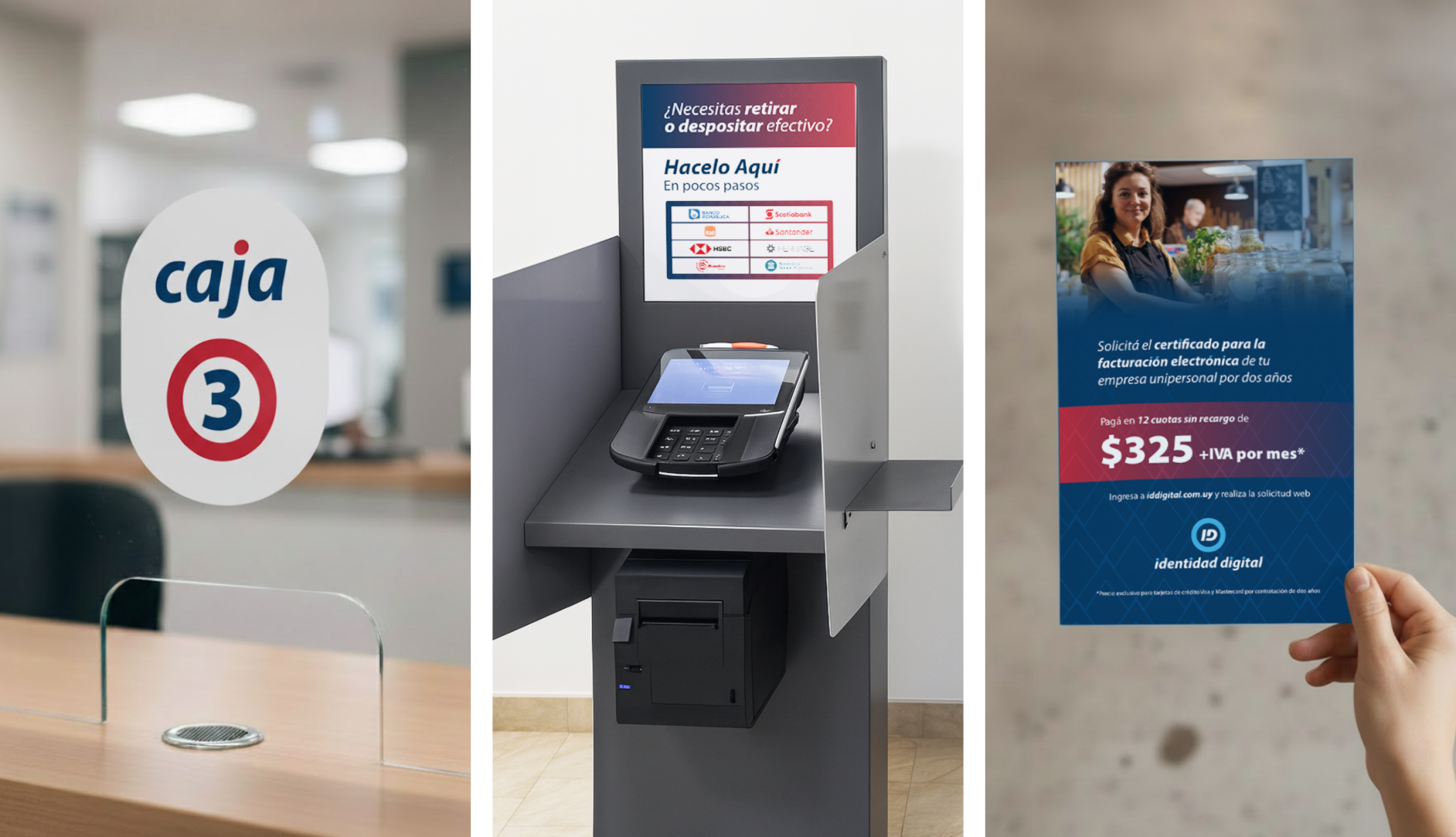
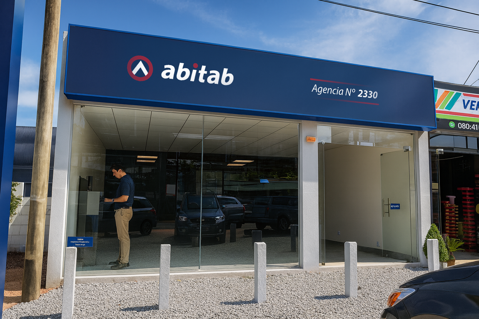
Images of selected applications of the identity system, including brochures, ATMs, and in-store signage.
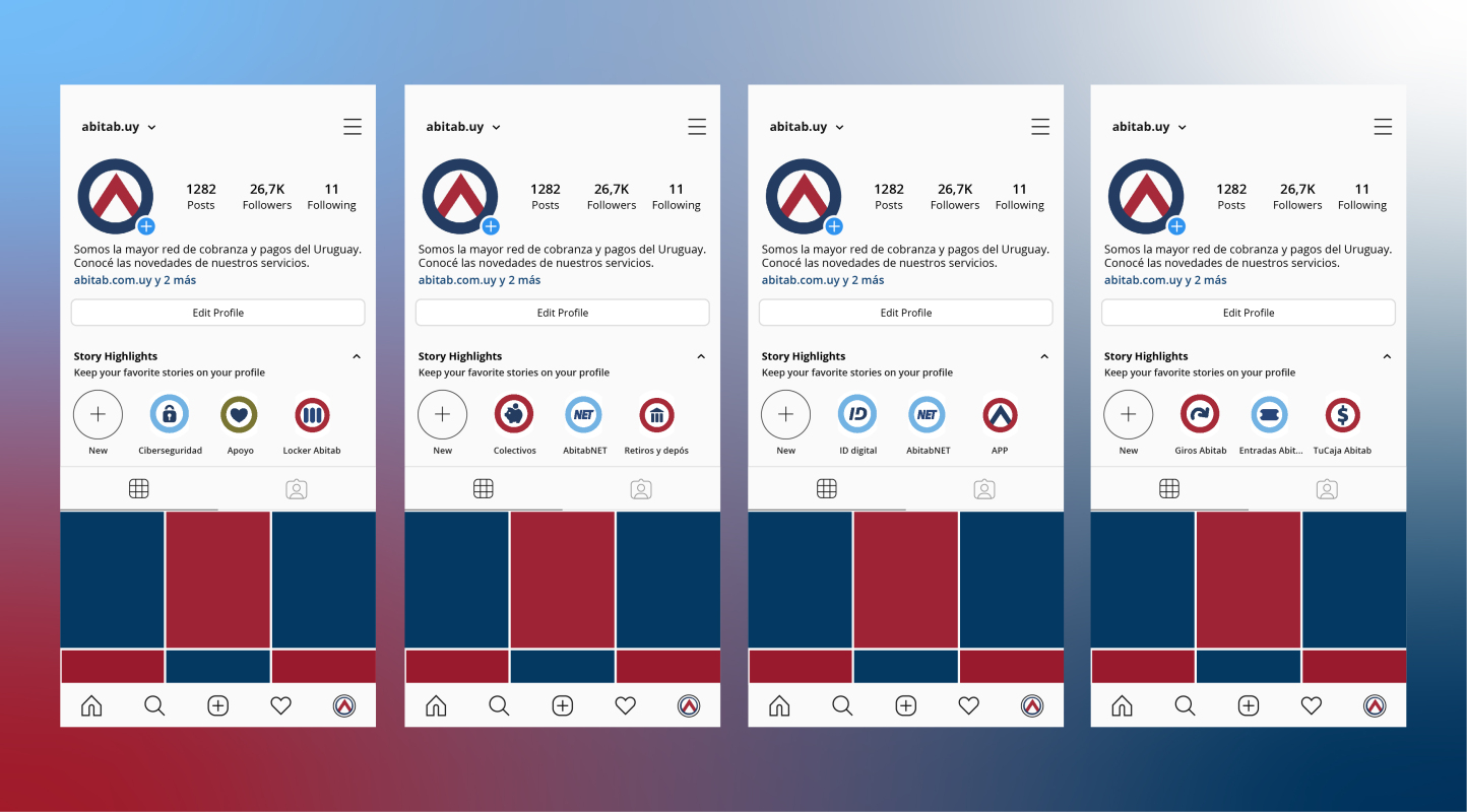
Instagram hightlight stories and profile.
In-store signage.
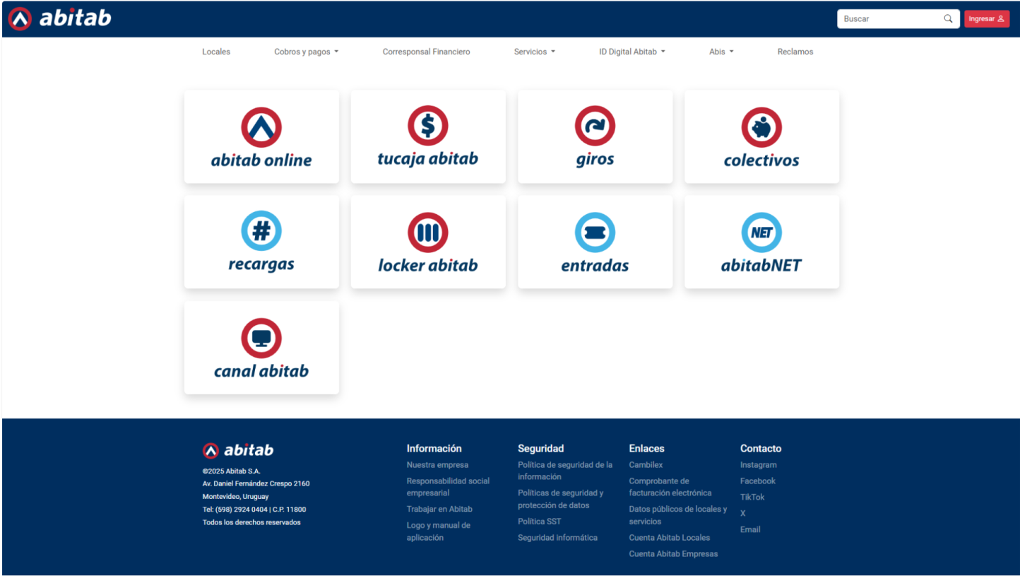
Website and new services sub-brands redesigns.

Employee uniform T-shirt.
This academic project provided a comprehensive opportunity to strengthen both strategic and technical design skills. Throughout the process, I developed experience in brand research and analysis, conceptual thinking, and decision-making based on client briefs, while learning to balance brand heritage with contemporary design needs.
The project also allowed me to refine practical skills in visual identity systems, typography, color theory, layout composition, and the development of consistent applications across physical and digital touchpoints. In addition, I improved my workflow through ideation, experimentation, prototyping, and presentation, reinforcing a structured and professional approach to branding projects.